Casestudy
Personal Development with personality
Client
Forward Bound
Sector
Personal Development
Project
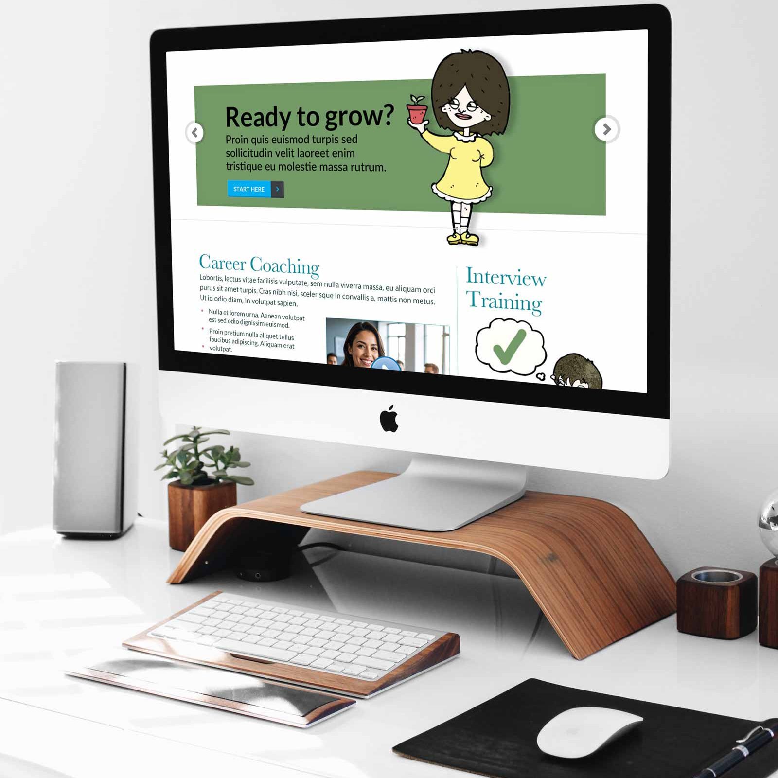
Identity, Website
Project Objective
To develop a brand identity for Sarah Dawrant, career coach, trainer, and psychologically informed practitioner—that reflects her emotionally intelligent, direct, and human-centred approach. The identity must feel personal, validating, and practical, while avoiding the generic tropes often associated with therapy and coaching.
Brand Goals
The identity for Forward Bound was built to speak plainly and powerfully to the emotional realities of working life. Rather than sidestepping discomfort, it leans into it—naming the dread, the stuckness, the quiet burnout that so many professionals carry. This emotional resonance is intentional: it builds trust not through promises, but through recognition.
Tone plays a central role in that trust. Every phrase is crafted in plain English, with warmth and strategic vulnerability. There’s no jargon, no posturing—just a steady, human voice that invites reflection and connection.
Visually, the brand is designed for clarity and calm. Its materials are clean, modular, and accessible, allowing users to scan, pause, and engage at their own pace. Nothing overwhelms; everything guides.
And perhaps most importantly, the identity avoids the tired visual and verbal tropes that saturate the coaching and therapy space. There are no stacked stones, no pastel gradients, no vague affirmations. Instead, the brand feels grounded, fresh, and unmistakably human.
Design Direction
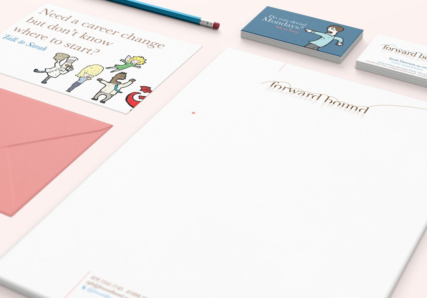
The visual language of Forward Bound is confident without being loud. A palette of orange and blue on white brings energy and clarity, steering clear of the soft-focus aesthetics often associated with wellness brands. Typography is chosen for legibility and rhythm—never ornamental, always intentional. Layouts are modular and spacious, giving each message room to breathe and each user space to feel.
The identity system includes:
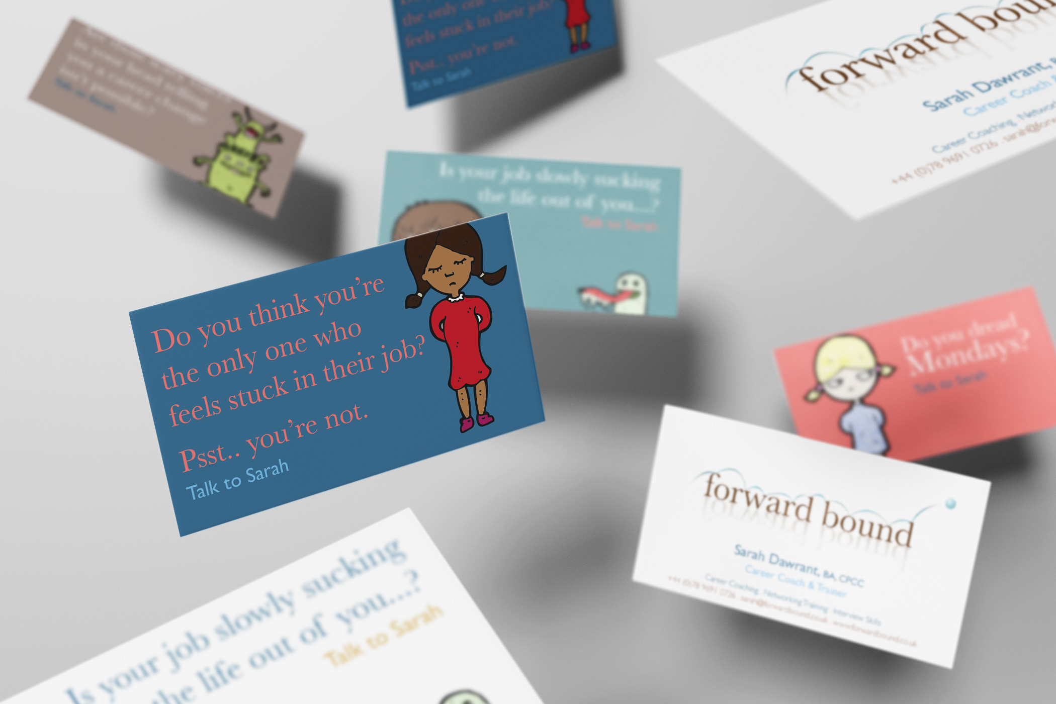
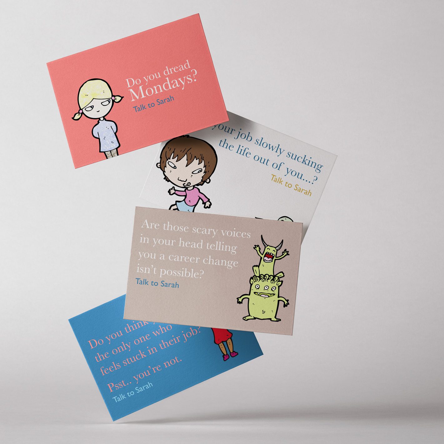
- Business cards with randomized backs: Each features a different emotional prompt, turning a transactional object into a moment of reflection.
- Postcards: Used for outreach and visibility, these mirror the card tone and reinforce brand consistency.
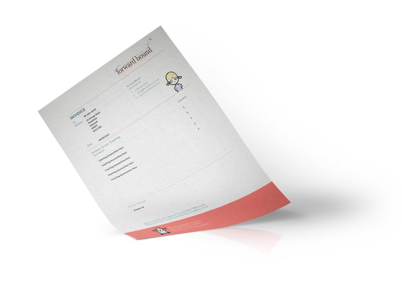
- Invoices: Even transactional materials carry the brand voice, with footer messages like “Recommend me to a new client and receive a discount.”
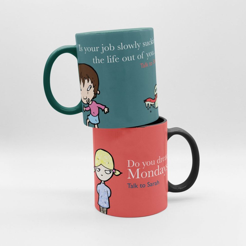
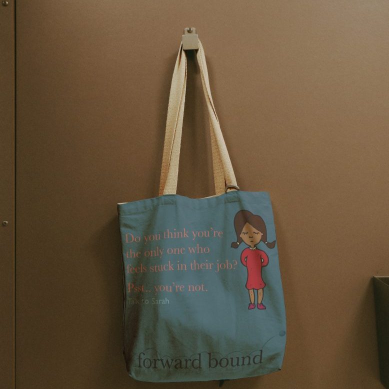
The “oddball” elements aren’t random, they’re emotionally strategic. They reinforce Sarah’s voice: direct, validating, and human. It’s conversational, slightly cheeky, and emotionally literate.
Messaging Strategy
The copy leads with emotional truth. Headlines don’t sugarcoat—they ask the questions people are already asking themselves: “Do you dread Mondays?” “Is your job slowly sucking the life out of you?” These aren’t hooks; they’re mirrors.
Calls to action are personal and consistent. “Talk to Sarah” appears across touchpoints, reinforcing the idea that this isn’t a faceless service—it’s a conversation with someone who listens.
And throughout, the language remains grounded. There’s no talk of “empowerment” or “transformational journeys.” Just plain, clear words that respect the reader’s intelligence and emotional state.
No lotus flowers, no stacked stones, no silhouetted figures on mountaintops. The identity avoids visual clichés that signal generic wellness or aspirational vagueness. No jargon or over-credentialing: Sarah’s qualifications are present but not performative. The emphasis is on emotional resonance, not authority. No “journey” metaphors in the abstract. Instead, the brand uses real-world discomforts as entry points, making the offer feel practical, not poetic.
Ready to build a brand that speaks human? Let’s craft identities that resonate, not just impress. Talk to Sarah. Or talk to me. Let’s move things forward.
Make the call
