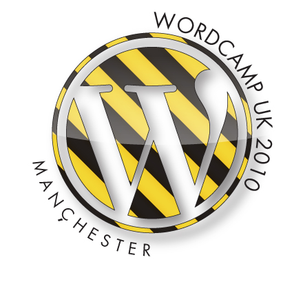
It’s the eve of the conference, or rather the ‘un-conference’ so a good time to highlight the work done on this year’s logo for WordCampUK.
Last year we had dragons as we were in Cardiff, this year due to being in Manchester and the people putting the event together being of a certain age (and musical heritage) we went for a Factory Records inspired logo.
The roundel is a core part of the WordPress and WorkCamp identity, the stylised W is very recognisable within the community so it made sense to blend that with the visual clues from Factory Records rich back catalogue. The black/yellow repeated pattern is instantly recognisable (and lets face it if not then a good time to catch up on both the music and the visuals of the era!), we’ve adapted it and updated it to work within the roundel.

It’s also been carried through onto the signage and the affectionate Factory Records homage continues on the limited edition commemorative tshirt too. Which I’ll share after the event, if you want to be the first to see it, you should be on a train to Manchester! Appropriately the Saturday night social will be at The Factory, FAC 251, there should be some happy but sore heads on Sunday morning! If you’re going then please come over and say hello.
Mad for it.
ps. And just incase those who know me better are wondering, yes the web 2.0â„¢ gloss is partly ironic.


